Boards
A board is a dashboard page containing apps, widgets, and Containers. Its name is unique and forms the board URL. Boards can be public or restricted to users and groups.
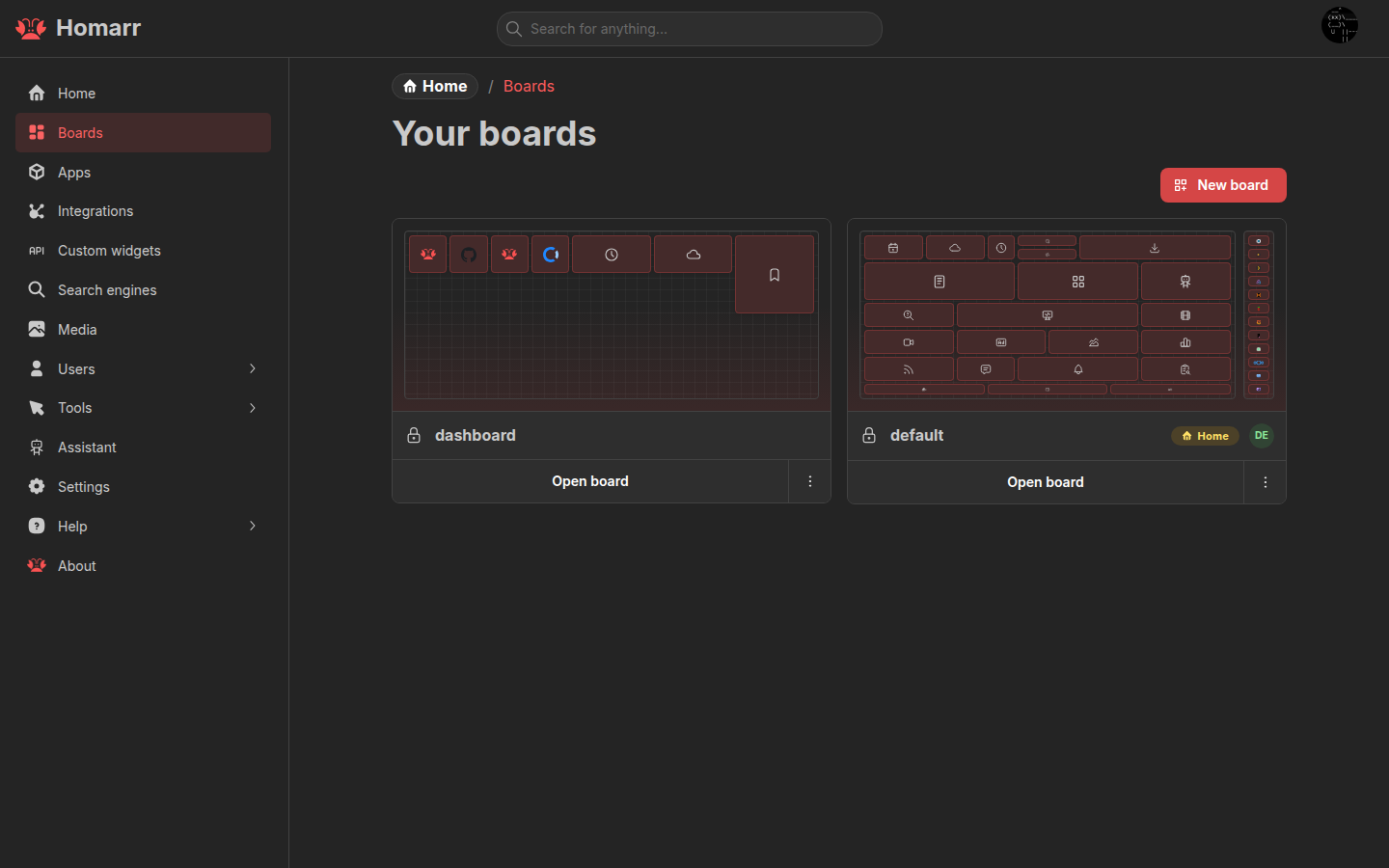
Create, duplicate, open, and delete boards under Management → Boards. Press Shift+C from a board to open the
board switcher.
Initial loading
Homarr starts supported widgets' initial data queries together on the server after resolving the board and its initial layout. Results stream independently while the board loads. The board remains visible as widgets fill in. App and bookmark tiles use the initial server HTML; other widgets show labeled cards until browser hydration. Previously loaded, bounded integration data and matching board RSS feeds can appear from the board's Redis snapshot while fresh data loads. If Redis is slow, Homarr starts uncached widget requests without waiting for that snapshot. Widgets without a cached result stay empty until their first result arrives. Integration queries for collapsed sections wait until opened, and queries that need another result start when that dependency resolves. Existing integration permissions and live refresh intervals still apply.
Responsive layouts
starts at 0pxstarts at 768pxunique breakpointMobile and Base are protected layouts. New boards use three Mobile columns; Base uses the column count selected at creation. Additional layouts use unique breakpoints. Homarr selects the layout with the highest breakpoint that fits the current viewport.
The logical grid uses fixed 200 × 200 cells with a 12px gap. Visible tile spacing also depends on card insets and
canvas scaling. Homarr scales the complete layout to the available width instead of changing each widget's proportions. Reset from Base regenerates a Mobile or custom layout from the
current Base layout.
Changing column or sidebar counts keeps a saved source arrangement while its generated positions remain unedited. Widening back restores that arrangement, including Container sizes. Moving, resizing, adding, or removing content starts a new source arrangement on the next layout resize. This cannot restore positions lost before this behavior was introduced; widen the affected Container before moving widgets into its right-hand columns.
Containers and rails
A Container groups apps, widgets, and nested Containers. It can have a label, collapse control, app-opening action, border color, and CSS classes. Click anywhere on a collapsible Container’s header to collapse or expand it. The header also supports Enter and Space; its app-opening action and edit controls work independently.
Items can occupy the outermost rows and columns of a Container. The drop preview shows the position where the item will remain when released. Dragging an item onto another item of the same size swaps their positions. Displaced items snap directly to their previewed positions without a movement animation and stay there when you release the pointer.
A rail reserves one to three columns at the left or right of a non-Mobile layout. Rails stay fixed while the page scrolls and store their contents separately for each layout. Layout settings and Manage Boards use the same preview, with enabled sidebars shown beside the main canvas.
Edit a board
Enter edit mode from the board header to add, move, resize, configure, or remove content. Save the board to persist the layout.
Dismissing the setup checklist is remembered per board in the current browser, independently of board contents. Clearing browser site data restores it; dismissal does not sync across browsers.
- Drag from an item's inactive content area; Containers use their grip.
- Hold
Ctrlon Windows/Linux orCmdon macOS to select several items. - Use Move / resize item for another canvas, rail, Container, or exact coordinates.
- Keyboard users can focus a tile, press Enter or Space, then move with arrow keys or resize with Shift + arrow keys.
- Press Escape during a pointer or touch interaction to restore the item to its previous position.
The add-content menu can create an app, integration, widget, or Container without leaving the board.
When adding apps, click one app to add it immediately, or choose Select multiple to add several at once. Ctrl/Cmd
click remains available as a shortcut.
Board settings
Board settings cover:
- General: page title, browser title, logo, and favicon.
- Layout: responsive layouts, breakpoints, columns, and rails.
- Background: image, attachment, size, and repeat behavior.
- Appearance: colors, opacity, icon color, and item radius.
- Custom CSS: styles applied only to the current board.
- Behaviour: app status and widget context-menu behavior.
See Styling for board and global CSS.
Outside edit mode, widgets may expose an advanced view and a context menu for status, refresh, quick options, settings, and actions. Available controls depend on the widget and the user's board and integration permissions. Closing the context menu does not cancel a widget refresh. Reopen it to see the current status.
Access control
Public boards are readable without signing in. Private boards require user, group, or global access.
| Board access | View | Edit content and settings | Access control, rename, delete |
|---|---|---|---|
| View | Yes | No | No |
| Modify | Yes | Yes | No |
| Full | Yes | Yes | Yes |
Inherited access comes from group permissions. Resource-specific access can be granted from the board's access-control section.
Renaming a board changes its URL without a redirect. Deleting a board is permanent.
In edit mode, nested Container settings controls are staggered to reduce overlap where space allows.
Home boards
A home board opens at / and /boards. Desktop and mobile home boards are separate from the responsive layouts
inside a board.
Defaults can be set for a user, group, or the whole server. User settings take priority, followed by matching groups,
the Everyone group, and server defaults. Server-wide fallback boards must be public.
See Users and groups and Server settings.
Widget previews
The add and edit dialogs use the target board section’s sizing and scale. Large widgets may be shrunk to fit the preview area; their content layout is preserved. Custom CSS that depends on dashboard ancestors may render differently inside the dialog.