Notebook
A simple notebook widget that supports markdown.
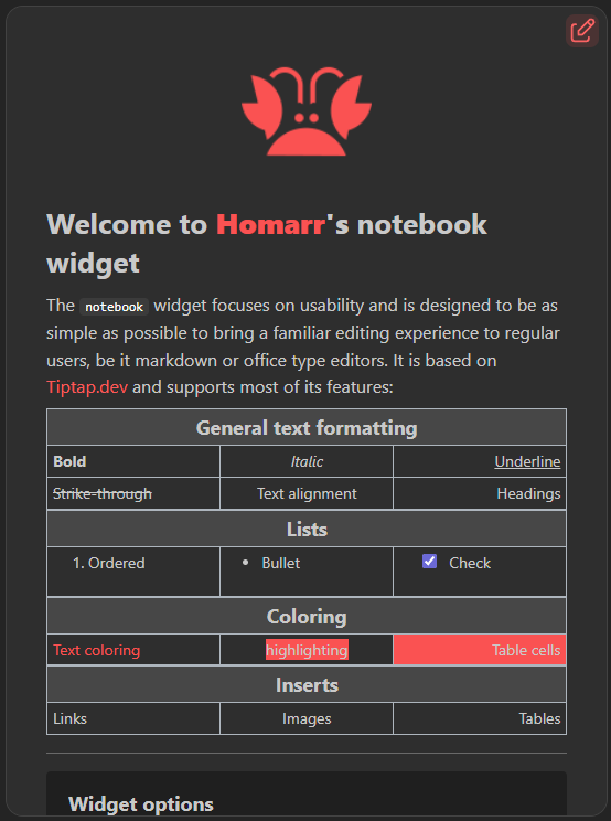
The notebook widget focuses on usability and is designed to be as simple as possible to bring a familiar editing experience to regular users. It is based on Tiptap.dev and supports most of its features.
Screenshots
Adding the widget
You can find how to add the widget on the Widgets documentation page.
Configuration
| Name | Description | Values | Default value |
|---|---|---|---|
| Show the toolbar to help you write markdown | Upon editing, enables a toolbar at the top with document editing functions. | yes / no | yes |
| Allow check in read only mode | Allows the ability to check the boxes from checklists outside of editing | yes / no | yes |
Editing
When the permissions of the user allows it, you can enter the editing of the text by clicking the following button in the top right.
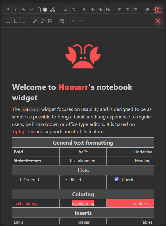
You can then decide to save your changes or cancel them to exit editing, using the buttons placed in the same location.
Notebook toolbar functions
The notebook offers a variety of functions to edit the text and more.

Common text formatting
| Function | Description |
|---|---|
| Bold | Makes the selected text bold |
| Italic | Tilts the selected text |
| Strikethrough | Puts a bar through the selected text |
| Color text | Changes the color of the text |
| Colored highlight text | Highlights the text with a chosen color |
| Code | Elevates the text to a box |
| Clear formatting | Erases any of the preceding function's effects on the selected text |
Heading
Choose a heading size for the line, making the text bigger. Working like titles and sub-titles.
Text Alignment
Select the alignment on the line. Left, center or right.
Text direction
Set the current paragraph or heading to left-to-right or right-to-left. This is useful when writing right-to-left text while Homarr is using a left-to-right language, or vice versa.
Misc functions
Blockquote
Puts the current line in a quoting block.
Horizontal line
Adds a line that goes from the far right to the far left as a separator.
Lists
Bullet lists
Simple list with a dot preceding each element.
Ordered lists
List with numbers preceding each element.
Check lists
List with a checkbox on each element.
Indentation changes
When you are currently in a list of any sort, the last 2 buttons will appear and will allow you to change the indentation of the current list item.
Insert functions
Link controls
The first buttons is to insert a link, or edit an existing link. The link will be applied on the selected text.
Pasting a link directly into the text will automatically put the link anchor on it too.
The second button will remove the link while leaving the text intact.

This is the modal for the link, The little button in the textbox can be clicked to make the link open in a new tab.
Image controls

Source
You can use a normal link to an image or you can also use locally stored images.
Width
The aspect ratio will always be respected, so only the width field is necessary. You can provide a value in a plain number or you can also use percents to have your image size dynamically change on different screens.
Table
This last control allows you to add a table, for which you can determine the number of columns and row before inserting it.

Clicking that button while in a table will delete it.
Table controls
While in a table, further controls will appear to help edit the table.
The first one will color the background of the selected cells.
The second will merge selected cells.
All the following ones are for editing the wize of the table:
- Add column on the right
- Add column on the left
- Delete Column
- Add row on top
- Add row below
- Delete Row